Hebrew & ttfautohint
Chrome will soon use DirectWrite for the rendering engine which means the total use of browsers that really need hinting will be around 15% (and those are really old and crappy that will gone soon), which means this post might not be relevant soon.
Every web designer has heard about hinting or more of the lack of hinting. Every type designer know how it’s a chore and that it’s a long and an expensive process. Moreover, auto hinting algorithms tend to do even worse job than not having hinting at all when it comes to Hebrew. Fortunately, the Open source community has made a very good tool which known as “ttfautohint”. Unfortunately, it was built for Latin alphabet and not for strange alphabets like Hebrew. Luckily, I have found a way to improve significantly the result. But, you need to know that there are some issues with Hebrew and ttfautohint.
Issues with ttfautohint:
- Remember it’s TTF. So, if you use an auto conversion of OTF (aka Post script flavor), you may find your letters look differently (Sorry Glyphs users)
- For get about ‘Nikud’ and other Opentype features. You’ll have to add those feature in VOLT after the hinting process. (Sorry Glyphs users, again)
- Because ttfautohint doesn’t support Hebrew, You can’t make multilingual font with the trick I’ll show you. That isn’t actually an issue on the web
- If your font is serif, sorry. It would probably useless to try. But, sometimes there are surprises
So.. How?
- Convert to TTF
- Remove OpenType features from the font, because mostly the font doesn’t work if you don’t. If you have to add OpenType features, add them after the process with programs like Font forge or VOLT
- Remove any Latin letters from the Font
- If ttfautohint doesn’t support Hebrew. Make it thinks it’s English! The most problematic thing about ttfautohint with
Hebrew is what I call ‘Jumping letters’, you will have some letters that will be taller / shorter than other, and it’s
related to the Alignment zones. ttfautohint will ignore alignment zones that are in the font before the process, but
you can fake it easily with the letter ‘o’. Usually lowercase ‘o’ is good for the alphabet and the Uppercase ‘O’ is
good for numbers, And usually lower case ‘o’ is just enough. Another thing which important is that the stems of the
‘o’ need to be exactly as in the Hebrew letters

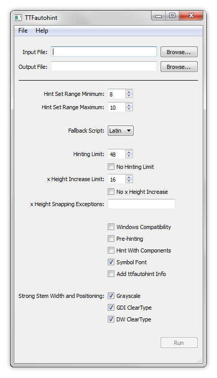
- After exporting the font, go to ttfautohint and for most fonts this properties will work great

- After hinting, All you need to do is removing the ‘o’ and ‘O’ glyphs. You can do that in a font editor of your choice as long as it support TTF. Font forge and Fontlab will do the job great
- In case you have a trouble with a single letter or more, you can hint the specific letter manually. It works great!
A few Notes
- “Fallback Script” must be “Latin” which is the only option yet. If you use “None”, Hebrew won’t be hinted. Also you have to check “Symbol Font”
- The numbers that are used in “Hint Set Range Minimum”, “Hint Set Range Maximum” and “x Height Increase Limit” are just because they have been found to suit most cases. It’s not a must thing, you might find other numbers better with your font
- “Hinting Limit” is 48 on purpose. The reason is because Chrome on GDI rendering uses Cleartype up 48 pixels height and from 49 it uses Grayscale which in these sizes mostly will look much better with no hinting at all
- In some cases “Windows Compatibility” is necessary. If your font is cropped use this option
- The reason for using only ‘O’ and ‘o’ for creating alignment zones. It related to the fact ttfautohint uses specific letters to create ‘blue zones’, but somehow it works the best with minimum information. For more information, here under the title “Blue Zones”
- On multilingual font you can split the font to two different files: Hebrew and Latin; Use this snippet in the CSS file to enable both Hebrew and Latin on the same Paragraph
html {
	font-family: "Font Name Eng", "Font Name Heb";
}
Enjoy!